In today’s data-driven world, the ability to communicate insights from complex datasets is more critical than ever. Power BI, a powerful business intelligence tool from Microsoft, empowers you to create visually compelling and interactive dashboards that transform raw data into impactful stories.
This comprehensive guide delves into the world of Power BI dashboards, exploring their benefits, the data storytelling process, and the key steps involved in building effective interactive dashboards.
The Power of Interactive Dashboards
Interactive dashboards offer a multitude of advantages over traditional static reports:
Enhanced User Engagement:
Users can interact with dashboards, drill down into specific data points, and explore information from various perspectives, fostering deeper understanding and analysis.
Improved Accessibility:
Dashboards present information in a visually appealing and easy-to-digest format, making data accessible to a wider audience, even those without extensive data analysis expertise.
Data Democratization:
Interactive dashboards empower users to explore data independently, fostering a data-driven culture within organizations.
Real-Time Insights:
Power BI dashboards can connect to live data sources, providing users with up-to-date insights that reflect the latest trends and business developments.
Actionable Intelligence:
Interactive dashboards can uncover hidden patterns and trends, enabling users to make informed decisions based on data-driven insights.
Data Storytelling with Power BI
Effective data storytelling is about transforming data into a compelling narrative that resonates with your audience. Here’s the process involved:
Define Your Audience:
Understanding your target audience is crucial. Consider their level of data literacy, what information they need, and how they will use the insights from your dashboard.
Identify Your Story:
What key message or insight do you want to convey with your data? Focus on a clear and concise narrative that addresses your audience’s specific needs.
Choose the Right Data:
Select the data sets that best support your chosen narrative. Ensure the data is accurate, relevant, and clean for effective analysis and visualization.
Design Engaging Visualizations:
Power BI offers a wide range of chart types and visualizations. Choose visuals that effectively represent your data and align with your storytelling goals.
Maintain Design Consistency:
A consistent design aesthetic across your dashboard enhances professionalism and improves user experience. Utilize formatting options and color schemes to create a visually cohesive presentation.
Focus on User Interactivity:
Leverage Power BI’s interactive features to allow users to explore data on their own terms. Utilize slicers, filters, and drill-down capabilities to empower user exploration.
Provide Context & Annotations:
Don’t let your data speak for itself entirely. Include contextual information, annotations, and clear labeling to guide users and ensure they understand the presented information.
By following these steps and harnessing the power of Power BI, you can craft data stories that capture attention, spark curiosity, and ultimately, drive meaningful action.
Building Interactive Dashboards in Power BI: A Step-by-Step Guide
Here’s a breakdown of the key steps involved in building interactive dashboards in Power BI:
Connect to Your Data Source:
Power BI offers connectivity to a wide range of data sources, including databases, spreadsheets, cloud storage services, and various online platforms. Select the data source that holds the information you want to visualize.
Import and Transform Your Data:
Once connected, Power BI allows you to import your data. The Power Query Editor provides powerful tools for data cleaning, transformation, and shaping your data to meet your visualization needs.
Create Your Visualizations:
Drag and drop the desired data fields onto the report canvas to create visualizations. Power BI offers a vast selection of charts, graphs, and other visual elements to represent your data effectively.
Format and Customize Visualizations:
Customize the appearance of your visualizations to enhance clarity and visual appeal. Power BI provides extensive formatting options for colors, fonts, labels, and more.
Add Slicers, Filters, and Drill-Down Capabilities:
Integrate interactive elements like slicers, filters, and drill-down features to allow users to filter data and explore specific areas of interest within your dashboard.
Build Your Dashboard Layout:
Arrange your visualizations and other dashboard elements in a clear and organized layout. Ensure the flow of information is logical and user-friendly.
Incorporate Text Annotations and Tooltips:
Provide contextual information through text annotations and tooltips. These elements guide users and ensure they understand the presented data.
Publish and Share Your Dashboard:
Once satisfied with your dashboard, publish it to the Power BI service for sharing with colleagues or stakeholders. Control access
Enhancing Your Power BI Dashboards
Here are some additional features and functionalities to consider when building your Power BI dashboards:
Conditional Formatting:
Utilize conditional formatting to highlight specific data points based on predefined conditions. This can draw attention to critical information or trends within your visualizations.
Create Calculated Columns and Measures:
Power BI allows you to create calculated columns and measures that extend your data analysis capabilities. These calculations can unlock new insights and enhance your data storytelling.
Utilize Bookmarks:
Bookmarks allow you to capture specific states of your dashboard with specific filters and slicers applied. This enables users to quickly switch between predefined dashboard views.
Embed Analytics in Reports:
Power BI lets you embed interactive reports within other documents like Word or Excel. This allows you to seamlessly integrate data insights into your broader communication strategies.
Leverage Q&A for Natural Language Exploration:
Power BI’s Q&A feature allows users to interact with dashboards using natural language queries. This empowers users to explore data independently and find answers to their specific questions.
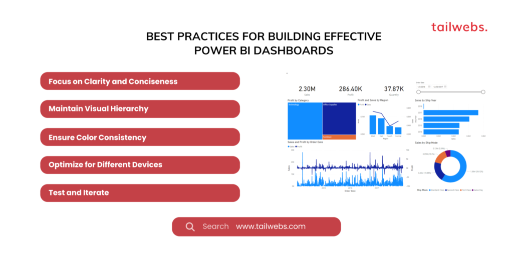
Best Practices for Building Effective Power BI Dashboards
Here are some key best practices to follow when building your Power BI dashboards:
Focus on Clarity and Conciseness:
Avoid information overload. Present only the most relevant data points and visualizations that support your chosen narrative.
Maintain Visual Hierarchy:
Organize your dashboard layout to create a clear hierarchy of information. Prioritize the most important visuals and guide users’ attention through the data story.
Ensure Color Consistency:
Maintain a consistent color scheme throughout your dashboard to enhance visual appeal and improve user comprehension.
Optimize for Different Devices:
With the rise of mobile BI, ensure your dashboard is responsive and adapts seamlessly to various screen sizes and devices.
Test and Iterate:
Gather feedback from users and iterate on your dashboard design based on their needs and preferences. A successful dashboard is an ongoing work in progress.
Considerations for Effective Data Storytelling with Power BI
Here are some additional factors to consider when crafting compelling data stories with Power BI:
Know Your Audience:
Tailor your data story to the specific needs and interests of your audience. Use visuals and language that resonate with them.
Start with a Strong Hook:
Grab your audience’s attention from the outset. Use impactful visuals or a surprising data point to pique their curiosity.
Focus on the “Why” Not Just the “What”:
Don’t just present data; explain its significance and implications. Highlight the “why” behind the trends and insights you’re presenting.
End with a Call to Action:
What do you want your audience to do after seeing your data story? Clearly articulate the desired outcome or next steps.
By following these best practices and considerations, you can transform your Power BI dashboards into powerful storytelling tools that engage your audience, inspire action, and drive positive business outcomes.
Conclusion: The Power of Data Storytelling with Power BI
In today’s information age, the ability to effectively communicate data insights is a valuable asset. Power BI empowers you to create interactive dashboards that transform raw data into compelling narratives. By following the steps outlined in this guide, leveraging best practices, and focusing on data storytelling principles, you can harness the power of Power BI to inform, engage, and inspire your audience with the magic of data.
