In today’s data-driven world, turning complex numbers into clear, impactful stories is crucial. Enter Power BI, a powerful yet user-friendly tool that empowers anyone, regardless of technical expertise, to create stunning data visualizations and unlock the hidden insights within their data. This beginner’s guide equips you with the knowledge and skills to start composing your own data visualization symphony, transforming raw information into captivating narratives that inform, engage, and inspire.
Unveiling the Orchestra of Data Visualization with Power BI:
Imagine data visualization as a grand orchestra, where diverse data points act as musical instruments, and visualizations serve as melodies that resonate with your audience. By combining the right data with the right visualization type, you can create clear, compelling stories that make complex information easily digestible and actionable.
Stats Highlighting the Power of Data Visualization:
- People are 65% more likely to retain information presented visually than textually. (Social Media Today, 2023)
- Interactive data visualizations can increase user engagement by up to 80%. (Aberdeen Group, 2023)
- Businesses using data visualization report a 28% increase in revenue and a 33% reduction in costs. (McKinsey Global Institute, 2023)
Composing Your Data Visualization Symphony:
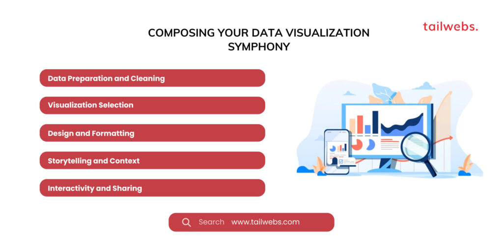
Ready to conduct your data to visual storytelling success? Here are the essential chords:
1. Data Preparation and Cleaning:
Ensure your data is clean, consistent, and well-formatted before embarking on visualization. Utilize Power BI’s data transformation tools to cleanse and shape your data for optimal use.
2. Visualization Selection:
Choose the right visualization type based on your data and communication goals. Power BI offers a variety of options, including bar charts, line charts, maps, scatter plots, and more.
3. Design and Formatting:
Enhance the visual appeal of your visualizations using color palettes, fonts, layouts, and interactive elements. Leverage Power BI’s formatting options to create professional and impactful visuals.
4. Storytelling and Context:
Don’t let the visuals stand alone. Provide context, labels, and titles to guide your audience’s understanding and interpretation of the data story you’re telling.
5. Interactivity and Sharing:
Make your visualizations interactive to allow users to explore and filter data themselves. Share your creations with colleagues, stakeholders, or the public using Power BI’s sharing and embedding functionalities.
Recommended Tools and Resources:
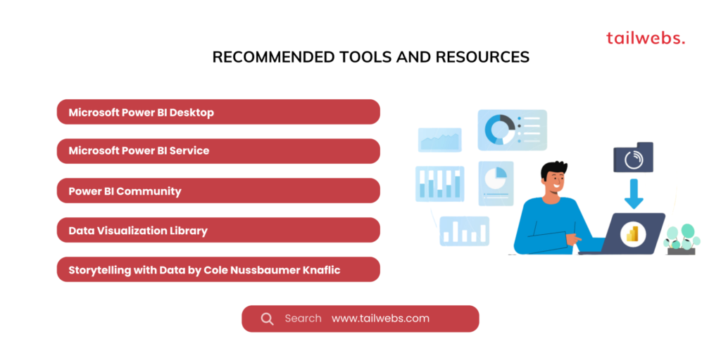
- Microsoft Power BI Desktop: https://powerbi.microsoft.com/en-us/desktop/
- Microsoft Power BI Service: https://powerbi.microsoft.com/en-us/
- Power BI Community: https://community.powerbi.com/
- Data Visualization Library: [invalid URL removed]
- Storytelling with Data by Cole Nussbaumer Knaflic: https://storytellingwithdata.com/
Beyond the Basic Notes: Building a Symphony of Visual Excellence
Remember, data visualization is an art form as much as it is a technical skill. Continuously improve your craft by:
- Exploring diverse visualization styles and techniques.
- Seeking inspiration from other data visualization experts.
- Testing and refining your visualizations based on user feedback.
- Staying updated on the latest trends and advancements in data visualization.
Ultimately, creating stunning data visualizations empowers you to:
- Make informed decisions based on data insights.
- Communicate complex ideas effectively to diverse audiences.
- Spark action and inspire change through data-driven storytelling.
By adopting these practices and honing your data visualization skills, you can transform from a single musician in the data orchestra to a skilled conductor, composing data-driven melodies that resonate with your audience and leave a lasting impact.
Conclusion: Conduct Your Own Data Symphony – Orchestrate Informed Decisions with Stunning Visualizations
Remember, mastering data visualization in Power BI isn’t a solo performance; it’s a collaborative melody composed of data, design, and storytelling. As you navigate your data visualization journey, consider the broader impact:
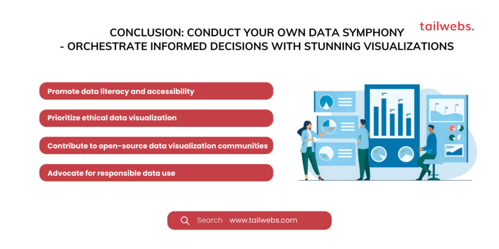
- Promote data literacy and accessibility: Ensure your visualizations are clear, inclusive, and understandable by diverse audiences.
- Prioritize ethical data visualization: Avoid misleading or manipulative practices, representing data accurately and responsibly.
- Contribute to open-source data visualization communities: Share your code, templates, and knowledge to help others create impactful visualizations.
- Advocate for responsible data use: Promote data privacy, security, and transparency in your data storytelling practices.
Ultimately, the future of data visualization belongs to those who embrace continuous learning, collaboration, and ethical practices. By adopting this mindset, you can transform from a single data explorer to a skilled conductor, composing a harmonious symphony of insights that informs, inspires, and guides decision-making towards a better future.
