Information is abundant, pouring in from various sources and in ever-increasing volumes. Businesses, organizations, and individuals are grappling with massive amounts of data, seeking to derive meaningful insights and make informed decisions. However, raw data alone is often overwhelming and difficult to comprehend. Data visualization is for your rescue here.
It is the art and science of representing data in visual formats such as charts, graphs, maps, and infographics. It transforms complex datasets into intuitive and visually compelling representations, making it easier for people to grasp patterns, identify trends, and extract valuable insights. As someone rightly said, “A picture is worth a thousand words,” and when it comes to data, this couldn’t be truer.
In today’s blog, we will explore the vast landscape of data visualization, delving into different visualization techniques and tools that empower us to unleash the true potential of data. We will discover how visualizations can be tailored to specific data types, learn best practices for designing effective visualizations, and explore the evolving trends shaping the field.
Why Data Visualization?
How to turn Data to Vision?
Imagine trying to comprehend a spreadsheet with thousands of rows and columns, each containing numbers and figures. It would be a daunting task, prone to errors and misinterpretations. However, when that same data is visualized as a clear and concise bar chart or line graph, patterns and insights leap off the screen, instantly conveying the story behind the numbers. Visualization provides a powerful means of simplifying complexity and distilling data into actionable insights.
-
- Say you are trying to understand the sales performance of your company over the past year. You have a spreadsheet filled with numbers representing sales figures, but it’s overwhelming to look at. By visualizing this data, you can transform those numbers into a line graph that shows how sales fluctuated over time. Suddenly, you can see patterns, peaks, and valleys that give you insights into the factors affecting your sales.
-
- Visuals can convey information quickly and efficiently, making them ideal for presentations, reports, and dashboards.
-
- Moreover, data visualization transcends barriers of language and technical expertise. Whether you are a business executive, a data analyst, or a casual user, visual representations break down the barriers of complex data sets, making information universally understandable.
-
- Raw data is often complex and difficult to make sense of. That’s where data visualization comes in, like a magic tool that helps us unlock the secrets hidden within the data.
-
- Think of data visualization as a translator that takes the intricate language of data and converts it into a visual story that our brains can easily understand. Instead of staring at numbers and trying to figure out what they mean, data visualization creates colorful charts, graphs, and diagrams that present the information in a clear and organized manner.
-
- Another reason why data visualization is crucial is its ability to uncover hidden patterns and relationships within data. Our brains are exceptional at spotting visual patterns, even when they are subtle or complex. By visualizing data, we can identify correlations, outliers, and anomalies that may have gone unnoticed in raw numbers alone. These insights can be invaluable for making informed decisions and taking action based on evidence.
For a better understanding of Data Visualization refer to our blog “A Basic Guide to Data Visualization”
Choose the Right Visualization Type for Your Data:
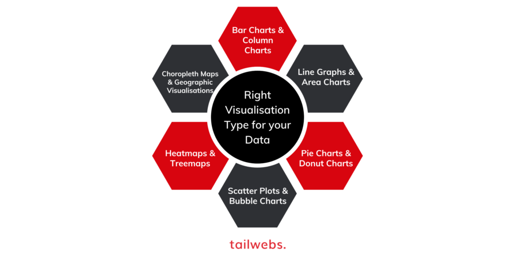
Data visualization is not one size fits all. Different types of data require different visualizations to effectively convey the intended message. Thus choosing the right visualization is crucial to ensure that the data is presented in a clear, informative, and visually appealing manner. Let’s explore some popular visualization types and their applications:
-
- Bar Charts and Column Charts: Bar charts and column charts are commonly used to compare categories or show the distribution of data. They are particularly useful when dealing with discrete or categorical data. For example, suppose you want to compare the sales performance of different products. A bar chart or column chart can present the sales figures for each product as individual bars, making it easy to identify the highest-selling and lowest-selling items.
- Line Graphs and Area Charts: Line graphs and area charts are effective for showing trends over time. They are often used to analyze time-series data, such as stock prices, temperature fluctuations, or website traffic. To understand the increase in website visitors over a year, a line graph can plot the number of visitors on the y-axis and the corresponding dates on the x-axis. This visualization allows you to observe any upward or downward trends and identify peak periods.
- Pie Charts and Donut Charts: Pie charts and donut charts are ideal for representing proportions and percentages. They are commonly used to showcase the composition of a whole. For example, if you want to illustrate the market share of different competitors in a specific industry, a pie chart can present the percentage of market share each competitor holds. The size of each slice represents the proportion, allowing viewers to quickly grasp the distribution of market share.
- Scatter Plots and Bubble Charts: Scatter plots and bubble charts are effective in visualizing relationships between variables. They are useful when analyzing numerical data with two or more dimensions. Let’s say you want to study the price and size of houses in a particular area, a scatter plot can plot each house as a point, with the x-axis representing the size and the y-axis representing the price. The positioning of the points reveals any correlation or patterns between these variables.
- Heatmaps and Treemaps: Heatmaps and treemaps are beneficial for visualizing large and complex datasets. Heatmaps use color gradients to represent values, while treemaps employ hierarchical structures to depict proportions. For example, a heatmap can display the intensity of customer satisfaction scores across different product features, with darker shades indicating higher satisfaction levels. On the other hand, a treemap can show the market share of various product categories, with each category represented by a rectangle proportionate to its share.
- Choropleth Maps and Geographic Visualizations: Choropleth maps and geographic visualizations are effective for presenting data based on geographical regions. They are commonly used to display demographic information, election results, or any data associated with specific locations. For instance, a choropleth map can illustrate population density across different states, with darker shades indicating higher population concentrations.
These are just a few types of the various range of visualizations available.
The Role of Intelligent Dashboards in Data Visualization
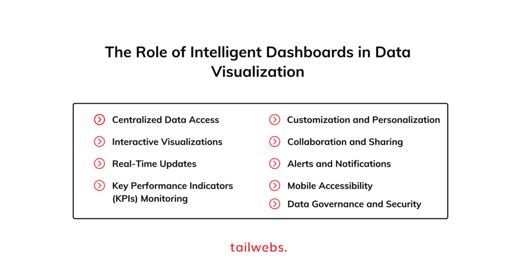
Intelligent dashboards play a vital role in data visualization by providing a comprehensive and dynamic overview of data in real-time. These dashboards offer a centralized platform where users can access and interact with visualizations, empowering them to make informed decisions and monitor key metrics efficiently. Here are some key elements of intelligent dashboards:
-
- Centralized Data Access: Intelligent dashboards integrate data from various sources, such as databases, spreadsheets, and cloud services, into a single location. This access eliminates the need for manual data gathering and allows users to view the most up-to-date information in one place.
-
- Interactive Visualizations: Dashboards offer interactive visualizations that enable users to explore data in-depth. They can interact with charts, graphs, and maps by applying filters, selecting specific time periods, or drilling down into details. This interactivity enhances data exploration and analysis capabilities.
-
- Real-Time Updates: Intelligent dashboards provide real-time updates, ensuring that the visualizations reflect the latest data changes. This feature is particularly valuable in dynamic environments where prompt decision-making is crucial, such as sales monitoring or live performance tracking.
-
- Key Performance Indicators (KPIs) Monitoring: Dashboards often incorporate KPIs, allowing users to track important metrics and performance indicators at a glance. By visualizing KPIs in a clear and concise manner, decision-makers can quickly assess the status and identify areas that require attention.
-
- Customization and Personalization: Intelligent dashboards offer customization options, allowing users to personalize their views based on their specific needs and preferences. They can rearrange visualizations, choose different chart types, or create personalized dashboards that focus on their unique objectives.
-
- Collaboration and Sharing: Dashboards facilitate collaboration by enabling users to share visualizations, insights, and reports with team members or stakeholders. This collaborative aspect enhances communication, promotes data-driven discussions, and ensures that everyone is on the same page.
-
- Alerts and Notifications: Intelligent dashboards can be configured to generate alerts and notifications based on predefined thresholds or anomalies in the data. This proactive feature helps users stay informed about critical changes or deviations from expected trends.
-
- Mobile Accessibility: Many intelligent dashboards are designed to be mobile-responsive, allowing users to access and interact with visualizations on smartphones and tablets. This mobile accessibility enables users to stay connected to their data even while on the go.
-
- Data Governance and Security: Intelligent dashboards prioritize data governance and security. They provide role-based access control, ensuring that only authorized individuals can view or modify sensitive data. Data encryption and secure authentication mechanisms are employed to protect data integrity.
Ways for Effective Data Visualization
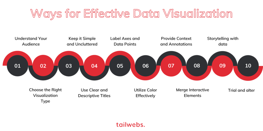
To create impactful and meaningful data visualizations, it’s essential to follow best practices that enhance clarity, comprehension, and the overall user experience. Here are some key approaches to consider when designing and presenting data visualizations:
-
- Understand Your Audience: Understand who will be viewing your visualizations and tailor them to their specific understanding level, needs, and level of expertise. Consider the background knowledge, goals, and preferences of your audience to create visualizations that effectively communicate the intended message.
- Choose the Right Visualization Type: Select the most appropriate visualization type that best represents the data and supports the insights you want to convey. Common types include bar charts, line graphs, pie charts, scatter plots, and maps. Each type has its strengths and is suited for different data patterns and relationships.
- Keep it Simple and Uncluttered: Simplify your visualizations by removing unnecessary elements and focusing on the most critical information. Avoid cluttering the visualizations with excessive labels, data points, or decorations that may distract or confuse viewers. Keep it clean and simple design.
- Use Clear and Descriptive Titles: Provide clear and concise titles for your visualizations that convey the main message or insight. The title should accurately summarize the information and guide viewers in interpreting the visualization.
- Label Axes and Data Points: Clearly label the axes of your visualizations, providing units of measurement and relevant context. Ensure that data points are labeled directly or through tooltips, allowing viewers to understand specific values and make accurate comparisons.
- Utilize Color Effectively: Use color purposefully to highlight key information or patterns in your visualizations. Choose a color scheme that is visually pleasing, accessible, and conveys the intended meaning. Avoid using excessive or conflicting colors that can confuse or overwhelm viewers.
- Provide Context and Annotations: Include contextual information, annotations, or captions to guide viewers in interpreting the visualization accurately. Clarify any abbreviations, acronyms, or unfamiliar terms, ensuring that the data is understandable to a wider audience.
- Merge Interactive Elements: Whenever possible, add interactive elements to your visualizations that allow users to explore the data further. Interactive features such as tooltips, filters, and zooming capabilities enable users to interactively analyze and drill down into specific aspects of the data.
- Storytelling with data: Structure your visualizations in a logical sequence that tells a story or conveys a narrative. Guide viewers through the data, highlighting the main insights, trends, or patterns. By creating a narrative flow, you can engage viewers and improve their understanding of the data.
- Trial and alter: Test your visualizations with a sample audience to gather feedback and identify areas for improvement. Iterate your design based on the feedback received, making necessary adjustments to enhance the clarity, effectiveness, and usability of the visualizations.
Need more tips? Read our article on Data Visualization Tips to enhance your Content Strategy.
Seize the Power of Data Visualization: Ignite Your Insights, Transform Your Success
By visually representing data in a meaningful way, data visualization helps us make informed decisions, identify opportunities, and communicate information effectively. It empowers us to extract valuable insights from data, communicate complex information effectively, and make data-driven decisions bridging the gap between raw data and actionable knowledge, enabling us to uncover meaningful patterns and trends. By embracing the evolving landscape of data visualization and leveraging emerging technologies, we can unlock new possibilities and stay ahead in an increasingly data-driven world.
Are you ready to supercharge your data-driven decision-making? Start visualizing your data with the help of our experts at Tailwebs. Fill out the form on this page and our team will get in touch with you.
